# Load necessary libraries
library(ggplot2)
library(dplyr) # Often used with ggplot2 for data prep8 Module 1.5: Data Visualization
“A picture is worth a thousand words” - this is especially true for data! Plots help us to:
- Explore: Understand the distribution of your traits (e.g.,
Yield,Height). See relationships between variables. Identify patterns. - Diagnose: Spot potential problems like outliers (strange values) or unexpected groupings. Check assumptions of statistical models.
- Communicate: Clearly present your findings to colleagues, managers, or in publications.
8.1 Introducing ggplot2: The Grammar of Graphics
R has basic plotting functions, but we will focus on the ggplot2 package, which is part of the tidyverse. It’s extremely powerful and flexible for creating beautiful, publication-quality graphics.
ggplot2 is based on the Grammar of Graphics. The idea is to build plots layer by layer:
ggplot()function: Start the plot. You provide:data: The data frame containing your variables.mapping = aes(...): Aesthetic mappings. This tellsggplothow variables in your data map to visual properties of the plot (e.g., mapYieldto the y-axis,Heightto the x-axis,Varietyto color).
geom_functions: Add geometric layers to actually display the data. Examples:geom_point(): Creates a scatter plot.geom_histogram(): Creates a histogram.geom_boxplot(): Creates box-and-whisker plots.geom_line(): Creates lines.geom_bar(): Creates bar charts.
- Other functions: Add labels (
labs()), change themes (theme_bw(),theme_minimal()), split plots into facets (facet_wrap()), customize scales, etc. Each function also allows you to edit aesthetic characteristics such as size, color, etc. You can explore all the customization options inggplot2’s documentation.
8.2 Let’s Make Some Plots!
First, load the necessary libraries:
Now, let’s create a sample breeding data frame for plotting.
set.seed(123) # for reproducible random numbers
breeding_plot_data <-
  tibble(
    PlotID = paste0("P", 101:120),
    Variety = factor(rep(c("ICARDA_A", "ICARDA_B", "Check_1", "Check_2"), each = 5)),
    Location = factor(rep(c("Baku", "Ganja"), each = 10)),
    Yield = rnorm(20, mean = rep(c(6, 7, 5, 5.5), each = 5), sd = 0.8),
    Height = rnorm(20, mean = rep(c(90, 110, 85, 88), each = 5), sd = 5)
  )

# Take a quick look at the data structure
glimpse(breeding_plot_data)
Rows: 20
Columns: 5
$ PlotID <chr> "P101", "P102", "P103", "P104", "P105", "P106", "P107", "P108…
$ Variety <fct> ICARDA_A, ICARDA_A, ICARDA_A, ICARDA_A, ICARDA_A, ICARDA_B, I…
$ Location <fct> Baku, Baku, Baku, Baku, Baku, Baku, Baku, Baku, Baku, Baku, G…
$ Yield <dbl> 5.551619, 5.815858, 7.246967, 6.056407, 6.103430, 8.372052, 7…
$ Height <dbl> 84.66088, 88.91013, 84.86998, 86.35554, 86.87480, 101.56653, …8.2.1 Scatter Plot: Relationship between Yield and Height
See if taller plants tend to have higher yield in this dataset.
# 1. ggplot(): data is breeding_plot_data, map Height to x, Yield to y
# 2. geom_point(): Add points layer
# 3. labs() and theme_bw(): Add labels and theme
plot1 <-
  ggplot(data = breeding_plot_data, mapping = aes(x = Height, y = Yield)) +
  geom_point() +
  labs(
    title = "Relationship between Plant Height and Yield",
    x = "Plant Height (cm)",
    y = "Yield (kg/plot)",
    caption = "Sample Data"
  ) +
  theme_bw() # Use a clean black and white theme

# Display the plot
plot1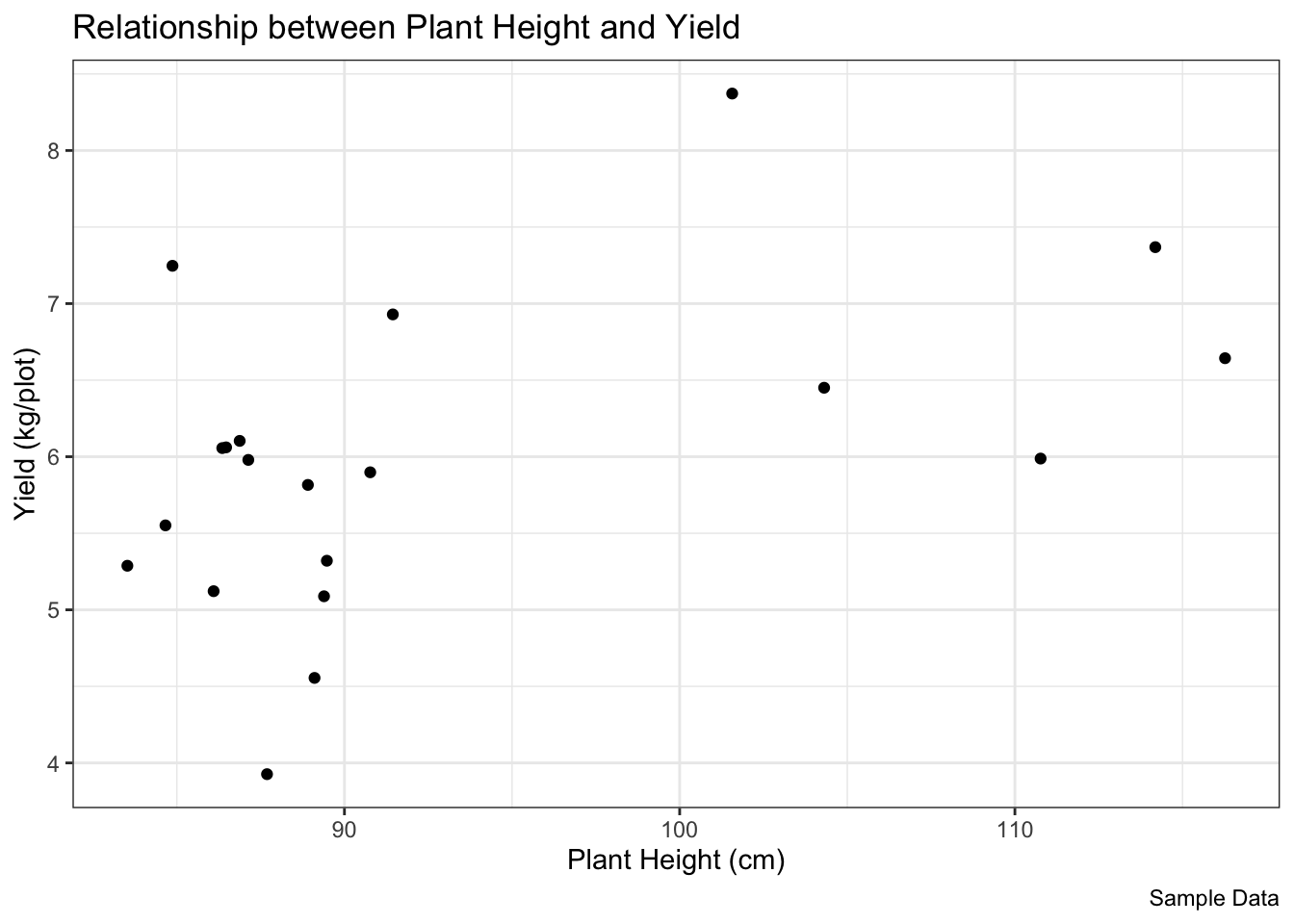
Let’s color the points by Variety:
# Map 'color' aesthetic to the Variety column
# Adjust point size and transparency for better visibility
plot2 <-
  ggplot(data = breeding_plot_data, mapping = aes(x = Height, y = Yield,
                                                  color = Variety)) +
  # Make points slightly bigger, semi-transparent
  geom_point(size = 2.5, alpha = 0.8) +
  labs(
    title = "Height vs. Yield by Variety",
    x = "Plant Height (cm)",
    y = "Yield (kg/plot)"
  ) +
  theme_minimal() # Use a different theme

# Display the plot
plot2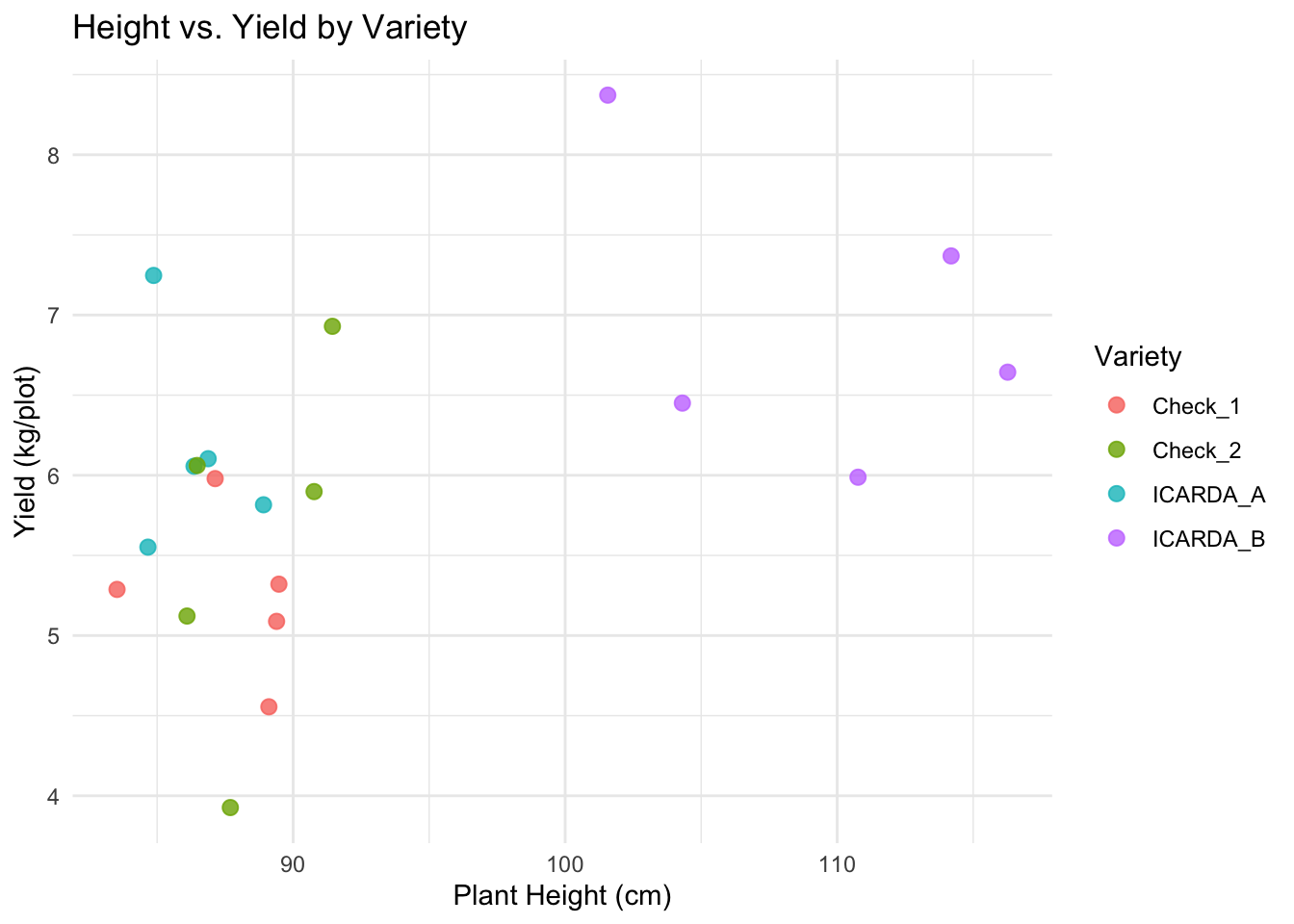
8.2.2 Histogram: Distribution of Yield
See the frequency of different yield values.
# 1. ggplot(): data, map Yield to x-axis
# 2. geom_histogram(): Add histogram layer. Adjust 'binwidth' or 'bins'.
# 3. labs() and theme_classic(): Add labels and theme
plot3 <-
  ggplot(data = breeding_plot_data, mapping = aes(x = Yield)) +
  # Specify binwidth, fill, and outline color
  geom_histogram(binwidth = 0.5, fill = "lightblue", color = "black") +
  labs(
    title = "Distribution of Plot Yields",
    x = "Yield (kg/plot)",
    y = "Frequency (Number of Plots)"
  ) +
  theme_classic()

# Display the plot
plot3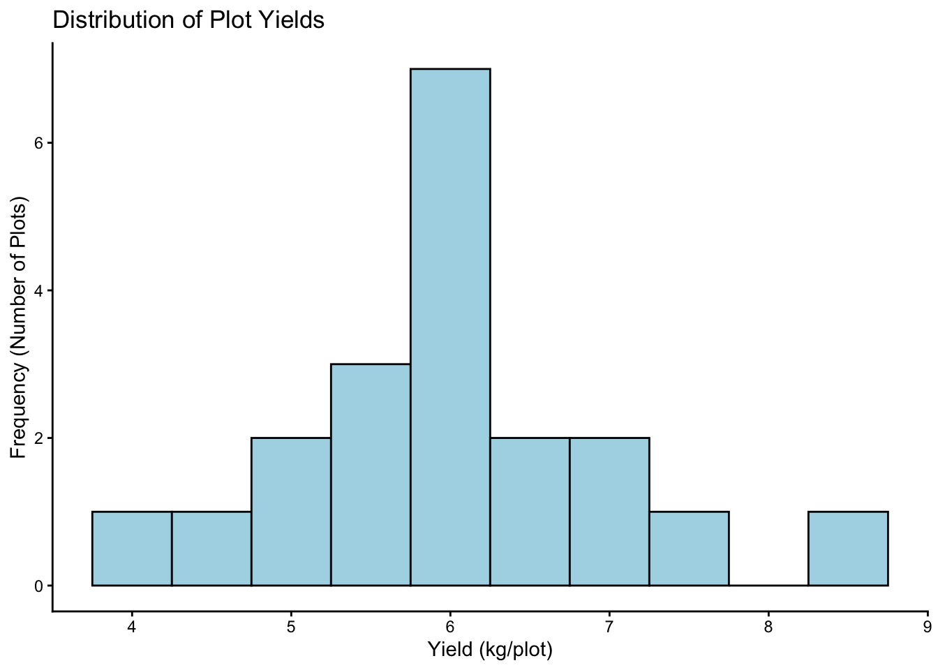
8.2.3 Box Plot: Compare Yield across Locations
Are yields different in Baku vs. Ganja? Box plots are great for comparing distributions across groups.
# 1. ggplot(): data, map Location (categorical) to x, Yield (numeric) to y
# 2. geom_boxplot(): Add boxplot layer. Map 'fill' to Location for color.
# 3. labs() and theme_light(): Add labels and theme
# 4. theme(): Customize theme elements (e.g., remove legend)
plot4 <-
  ggplot(data = breeding_plot_data, mapping = aes(x = Location, y = Yield,
                                                  fill = Location)) +
  geom_boxplot() +
  labs(
    title = "Yield Comparison by Location",
    x = "Location",
    y = "Yield (kg/plot)"
  ) +
  theme_light() +
  # Hide legend if coloring is obvious from x-axis
  theme(legend.position = "none")

# Display the plot
plot4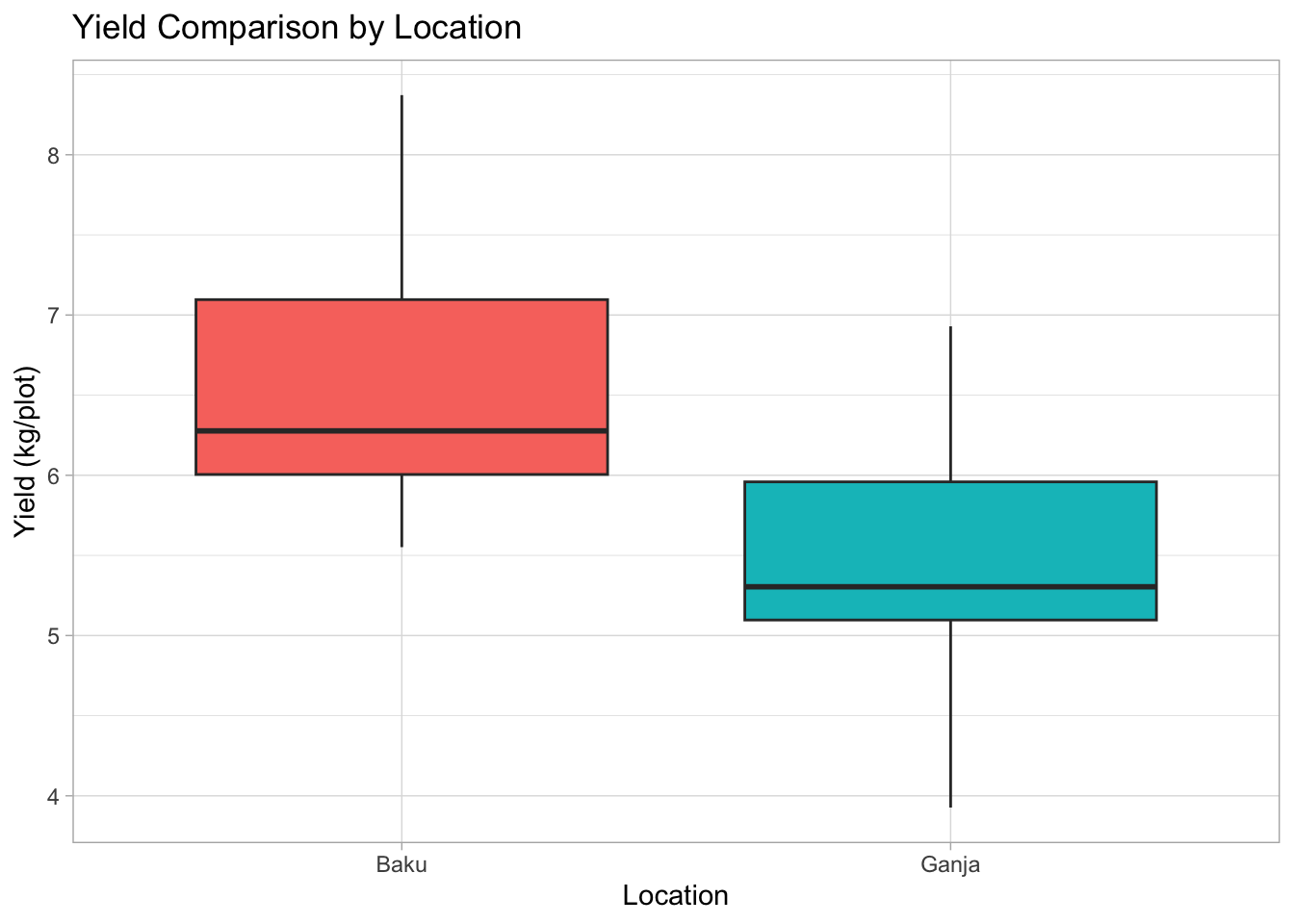
Box plot anatomy: The box shows the interquartile range (IQR, middle 50% of data), the line inside is the median, whiskers extend typically 1.5*IQR, points beyond are potential outliers.
8.3 Saving Your Plots
Use the ggsave() function after you’ve created a ggplot object (like plot1, plot2, etc.).
# Make sure the 'output/figures' directory exists
# The 'recursive = TRUE' creates parent directories if needed
output_dir <- "output/figures"
if (!dir.exists(output_dir)) {
  dir.create(output_dir, recursive = TRUE)
}

# Save the height vs yield scatter plot (plot2)
ggsave(
  filename = file.path(output_dir, "height_yield_scatter.png"), # Use file.path for robust paths
  plot = plot2,                               # The plot object to save
  width = 7,                                  # Width in inches
  height = 5,                                 # Height in inches
  dpi = 300                                   # Resolution (dots per inch)
)

# You can save in other formats too, like PDF:
# ggsave(
#   filename = file.path(output_dir, "yield_distribution.pdf"),
#   plot = plot3,
#   width = 6,
#   height = 4
# )
8.4 Exercise
Create a box plot comparing Plant Height (Height) across the different Varieties (Variety) in the breeding_plot_data. Save the plot as a PNG file named height_variety_boxplot.png in the output/figures directory.
# Exercise: Box plot comparing Plant Height across Varieties
plot5 <-
  ggplot(data = breeding_plot_data, mapping = aes(x = Variety, y = Height, fill = Variety)) +
  geom_boxplot() +
  labs(
    title = "Plant Height Comparison by Variety",
    x = "Variety",
    y = "Plant Height (cm)"
   ) +
  theme_light() +
  theme(legend.position = "none")

# Display the new plot
plot5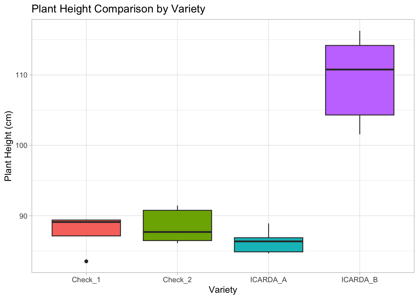
# Ensure output directory exists
output_dir <- "output/figures"
if (!dir.exists(output_dir)) {
  dir.create(output_dir, recursive = TRUE)
}

# Save the box plot as a PNG file
ggsave(
  filename = file.path(output_dir, "height_variety_boxplot.png"),
  plot = plot5,
  width = 7,
  height = 5,
  dpi = 300
)